How we Report
Keep track of these metrics in actionable reports
1. Goal - Creating actionable dashboards
What You've Already Built
In the How we Measure lesson, you set up tracking systems that capture data: spreadsheets for manual metrics, automated tools for website/ad data, CRM events for the complete customer journey, and product database tracking for user behavior. Now you have data flowing in–but raw data isn't useful until you turn it into actionable dashboards.
What You're Deciding Here
This lesson helps you make a critical strategic decision: What dashboards should you create, and how do they connect to your funnel? Not all dashboards are created equal. Some dashboards show everything but reveal nothing. Others focus on what matters at each stage and drive decisions.
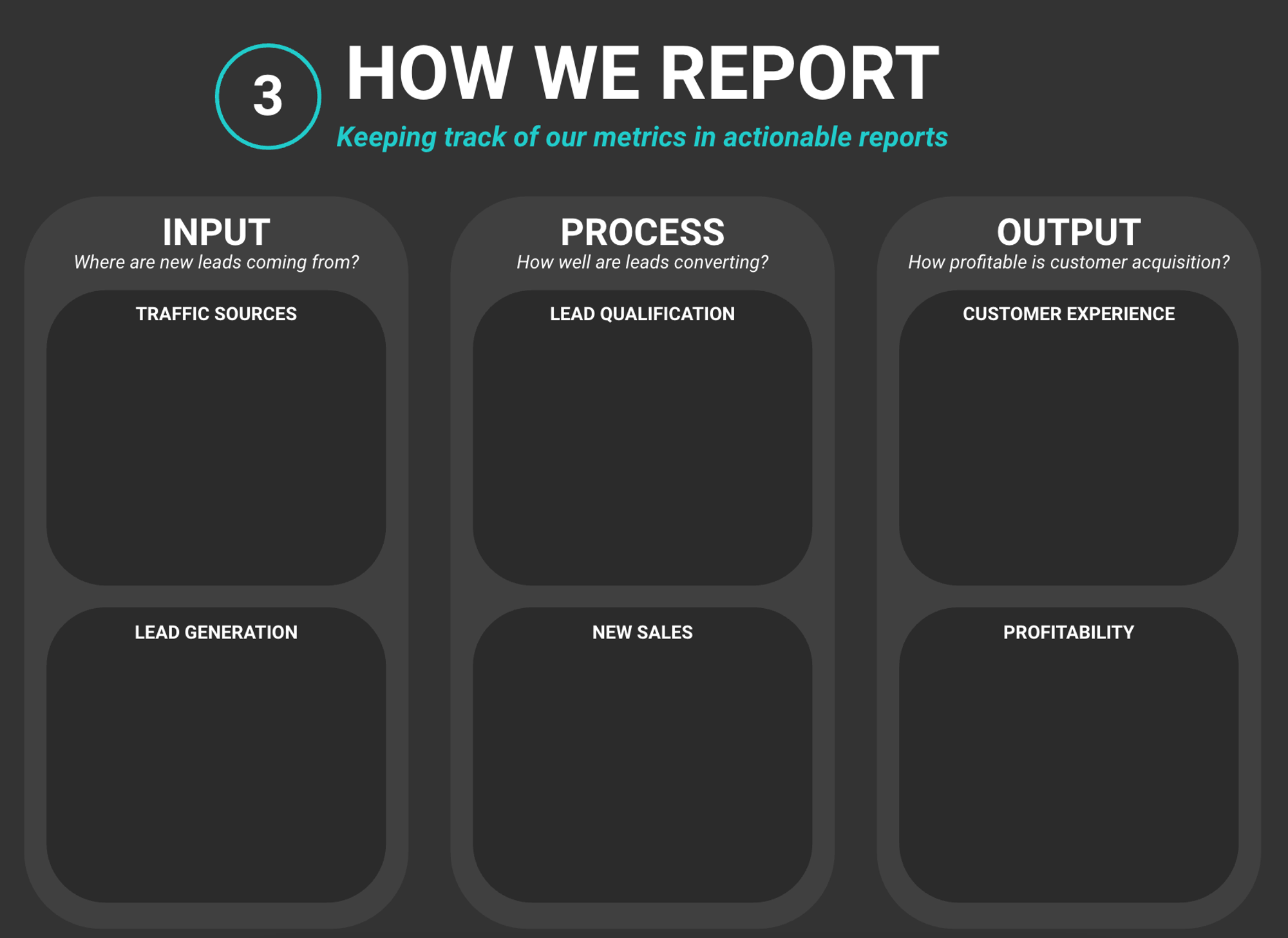
The goal is to create four types of dashboards that work together:
North Star Metric Dashboard - Track your most important metric and its leading/lagging indicators (the one number that represents success)
Input Dashboards - Track what's coming in: traffic sources, volume, and cost (ToFu metrics that lead to your North Star)
Process Dashboards - Track what's happening: leads, qualification, conversion to customers (MoFu/BoFu metrics that lead to your North Star)
Output Dashboards - Track what you're achieving: customer experience, satisfaction, business health (GroFu metrics that lag your North Star)
What Should You Focus On First?
Your starting point depends on your business situation:
Always Start with Your North Star Metric Dashboard
Your North Star Metric dashboard is your foundation–it shows the one number that matters most and how leading/lagging metrics connect to it. Create this first, then build Input, Process, and Output dashboards that connect to your North Star.
If You're Just Getting Started
Start with your North Star Metric dashboard plus one Input dashboard that shows your top traffic sources, volume, and cost. This helps you understand what's working and how it connects to your North Star. Add Process and Output dashboards as you grow.
If You Have Multiple Funnel Stages
Create all four dashboard types (North Star, Input, Process, Output) to see the complete picture. This helps you identify where problems occur, where opportunities exist, and how everything connects to your North Star. Review each dashboard weekly, compare monthly.
If You Have a Team
Create shared dashboards that everyone can access. Use dashboard tools (Looker Studio, CRM dashboards, product analytics) so the team sees the same data. Make sure your North Star Metric dashboard is front and center–everyone should know what success looks like. Set up automated reports that email weekly summaries.
Your Decision
By the end of this lesson, you'll have four types of dashboards that turn your data into actionable insights–starting with your North Star Metric dashboard, then Input, Process, and Output dashboards that all connect to and support your North Star.
2. North Star Metric Dashboard - Your most important metric
Your North Star Metric dashboard is your foundation–it shows the one number that matters most and how leading/lagging metrics connect to it. This dashboard should be the first one you create and the one you check most often.
What Your North Star Metric Dashboard Tracks
Your North Star Metric:
- The one most important metric that represents success (from your Metrics Overview document)
- Current value, trend over time, target/goal
- Week-over-week, month-over-month changes
Leading Metrics:
- Metrics that predict your North Star Metric (they move before your North Star)
- Examples: If North Star is MRR, leading metrics might be trial signups, feature adoption, engagement
- These help you see if you're on track before the North Star moves
Lagging Metrics:
- Metrics that confirm your North Star Metric (they move after your North Star)
- Examples: If North Star is MRR, lagging metrics might be churn rate, customer satisfaction, profitability
- These help you understand the impact of your North Star
Why Your North Star Metric Dashboard Matters
Your North Star Metric dashboard helps you:
- Stay focused: One number to optimize for, not dozens
- Predict success: Leading metrics show if you're on track
- Confirm impact: Lagging metrics show if improvements are working
- Make decisions: If it doesn't move the North Star, it's lower priority
- Align team: Everyone knows what success looks like
Best Practices
- Make it visible: Put this dashboard front and center–check it daily or weekly
- Track leading metrics: Focus on metrics that predict your North Star
- Watch lagging metrics: Use them to confirm your North Star is healthy
- Set targets: Know what "good" looks like for your North Star
- Connect everything: All other dashboards should connect back to your North Star
Outcome: You have a North Star Metric dashboard that shows your most important metric and how leading/lagging metrics connect to it.
3. Input Dashboards - Traffic sources, volume, and cost
Input dashboards track what's coming into your funnel: traffic sources, volume, and cost. These dashboards answer the question: "Where are new leads coming from?" and connect to your North Star Metric by showing which traffic sources drive leading indicators that predict your North Star.
What Input Dashboards Track
Traffic Sources:
- Where visitors come from (organic search, paid ads, social media, direct, referrals)
- Volume from each source (visitors, sessions, page views)
- Cost per source (ad spend, content creation costs, time investment)
- Quality indicators (bounce rate, time on site, pages per session)
Key Metrics to Include:
- Traffic Volume: Total visitors, sessions, page views
- Traffic Sources: Breakdown by channel (organic, paid, social, direct, referral)
- Cost per Source: Ad spend, content costs, time investment
- Cost per Visitor: Total cost divided by visitors
- Source Quality: Bounce rate, time on site, engagement by source
Why Input Dashboards Matter
Input dashboards help you understand:
- What's working: Which traffic sources bring the most visitors?
- What's cost-effective: Which sources give you the best ROI?
- Where to invest: Should you double down on organic or paid?
- What to optimize: Which sources need improvement?
- How it connects to your North Star: Which traffic sources drive leading metrics that predict your North Star Metric?
Best Practices
- Track all sources: Don't just look at total traffic–break it down by source
- Include cost data: Track both volume AND cost to understand efficiency
- Compare periods: Week-over-week, month-over-month comparisons show trends
- Focus on quality: Volume matters, but quality (engagement, conversion potential) matters more
Outcome: You have an Input dashboard that tracks traffic sources, volume, and cost so you can see what's coming into your funnel.
4. Process Dashboards - Lead generation, qualification, and conversion
Process dashboards track what's happening with your traffic and leads: lead generation, qualification, and conversion to customers. These dashboards answer the question: "How well are leads converting?" and connect to your North Star Metric by showing which conversion activities drive leading indicators that predict your North Star.
What Process Dashboards Track
Lead Generation:
- How many leads are coming in (from each source, each campaign)
- Lead volume trends (up, down, flat)
- Cost per lead (total cost / leads generated)
- Lead quality indicators (source, engagement, qualification score)
Lead Qualification:
- How many leads are qualified (meet your criteria)
- Qualification rate (qualified leads / total leads)
- Time to qualify (how long it takes)
- Quality by source (which sources bring better leads)
New Sales:
- How many leads convert to customers
- Conversion rate (customers / leads)
- Sales cycle length (time from lead to customer)
- Revenue per customer
Key Metrics to Include:
- Lead Volume: Total leads, leads by source, leads by campaign
- Cost per Lead: Total cost / leads generated
- Qualification Rate: Qualified leads / total leads
- Conversion Rate: Customers / qualified leads (or customers / total leads)
- Sales Cycle: Time from lead to customer
- Revenue per Customer: Total revenue / customers
Why Process Dashboards Matter
Process dashboards help you understand:
- What's working: Which sources/campaigns bring the best leads?
- Where leads drop off: Are leads not qualifying? Not converting?
- What to optimize: Which part of the process needs improvement?
- How efficient you are: Are you converting leads efficiently?
- How it connects to your North Star: Which conversion activities drive leading metrics that predict your North Star Metric?
Best Practices
- Track the full journey: Lead generation → qualification → conversion
- Break down by source: See which sources bring better leads
- Calculate rates: Don't just look at numbers–look at conversion rates
- Compare periods: Week-over-week, month-over-month comparisons show trends
- Focus on bottlenecks: Identify where leads are dropping off
Outcome: You have a Process dashboard that tracks lead generation, qualification, and conversion so you can see how well your funnel is working.
5. Output Dashboards - Customer experience and business health
Output dashboards track what you're achieving: customer experience, satisfaction, and business health. These dashboards answer the question: "How profitable is customer acquisition?" and connect to your North Star Metric by showing lagging indicators that confirm your North Star is healthy and sustainable.
What Output Dashboards Track
Customer Experience:
- Customer satisfaction scores (NPS, CSAT, reviews)
- Product usage and engagement (feature adoption, activity levels)
- Support metrics (ticket volume, resolution time, satisfaction)
- Retention indicators (churn rate, renewal rate, lifetime value)
Profitability:
- Revenue vs. expenses (are you profitable?)
- Customer acquisition cost (CAC) vs. lifetime value (LTV)
- Profit margins (gross margin, net margin)
- Growth metrics (revenue growth, customer growth, profit growth)
Key Metrics to Include:
- Customer Satisfaction: NPS, CSAT, reviews, ratings
- Product Engagement: Feature usage, activity levels, retention
- Support Health: Ticket volume, resolution time, satisfaction
- Revenue: Total revenue, recurring revenue, revenue per customer
- Expenses: Total expenses, cost per customer, operating costs
- Profitability: Revenue - expenses, profit margins, CAC vs. LTV
- Growth: Revenue growth rate, customer growth rate, profit growth
Why Output Dashboards Matter
Output dashboards help you understand:
- Are customers happy?: Is your product/service delivering value?
- Are you profitable?: Is revenue greater than expenses?
- Is growth sustainable?: Are you growing profitably?
- What to improve: Where should you focus to improve business health?
- How it confirms your North Star: Do lagging metrics confirm your North Star Metric is healthy and sustainable?
Best Practices
- Track both experience and profit: Happy customers AND profitable business
- Calculate ratios: CAC vs. LTV, revenue vs. expenses, growth rates
- Compare periods: Month-over-month, quarter-over-quarter comparisons
- Focus on trends: Are things getting better or worse?
- Connect to inputs: See how Input and Process dashboards affect Output
Outcome: You have an Output dashboard that tracks customer experience and business health so you can see if your business is profitable and sustainable.
6. Your Dashboards
Creating Your Dashboards Document
Throughout this lesson, you've designed four types of dashboards: your North Star Metric dashboard (the foundation), Input dashboards for traffic sources and cost, Process dashboards for lead generation and conversion, and Output dashboards for customer experience and business health. Now it's time to create a single overview document that shows all your dashboards and how they connect to your North Star Metric.
The Goal: Complete Overview of All Your Dashboards
This dashboard overview will serve as your reference for:
- Seeing all your dashboards in one place
- Understanding how dashboards connect to your funnel stages
- Knowing what metrics each dashboard tracks
- Understanding how to interpret and act on each dashboard
Outcome: You have a complete dashboard overview that shows all your dashboards and how they work together.